Tag

cardview

Browsing

If you build mobile applications for the Android platform then you are no doubt already familiar with Android Studio, a popular tool and the official Integrated Development Environment (IDE) for Android app development.

Equally, you’ve likely heard of Github and Git. Git is a free and open-source, distributed version control system that lets you manage and track changes in files used in programming. GitHub, is one of many cloud-based hosting services that allows you to manage your Git repositories. Github enables collaborative project development, as multiple programmers can work on project code together. Developers can track and control code changes made by others and, if necessary, return to a state of code before any given change was made, making it an extremely helpful tool.

Android Studio has a user interface that makes it incredibly easy to work with Git without any additional software. In this article, we will show how to clone a repository and work with it using Android Studio and basic Git commands.

Make sure you have a Github account and Android Studio installed and then read on to discover the best way to work with these tools.

Glossary

Before we get started, here are some useful terms worth understanding:

Branch – Branches allow you to work on new features, fix bugs, or develop new ideas in an isolated space within your repository. Branches are needed to isolate development work, so that other branches in the repository are not affected. The existence of branches means that developers can work together on a project and not interfere with each other’s work.

Commit – A commit is like a snapshot (copy) of your repository at specific times. Commits include metadata in addition to the contents and message, like the author, timestamp, and more. The commit history allows you to track changes and if a mistake was made, you can easily find and return to the commit where it happened.

Repository – A repository is a central location where data for your project is stored and managed. A repository contains all of your project’s files and tracks and saves a history of all changes made to files in a project.

The local repository exists on the local machine and can be seen only by the local user.

The remote repository is stored in the cloud, and its local copies are located on the computers of developers. When a developer makes changes to the local version, it can be synchronized with the remote one.

Step 1: Cloning a repository

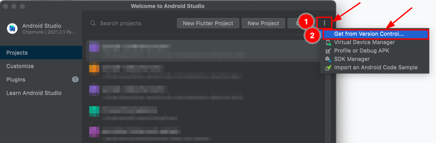
First you need to open Android Studio.

  1. Press the More Actions command (3-dot icon) on the top row.
  2. Select from the drop-down list “Get from Version Control.”
cloning a repository with Android Studio

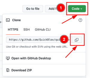
Then you need to copy the repository URL that you wish to use from Github.

Go to GitHub and select the project you want to clone and copy the repository URL. For example GitHub – QuickBlox Android Samples. QuickBlox code samples for Android provide an efficient way to add chat or video calling functionality to your application, saving you time from having to code from scratch.

cloning a repository in Android Studio
  1. Press the “Code” button.
  2. Press the Copy URL icon button.

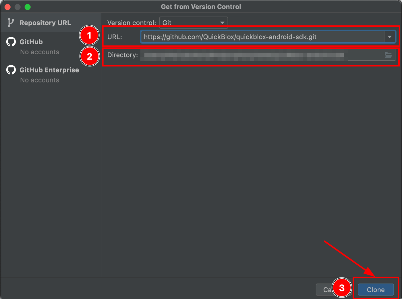
Now return to Android Studio to clone the repository.

cloning a repository with Android Studio
  1. Insert the URL of the repository that you want to clone.
  2. Select the directory where the repository will be cloned.
  3. Press the “Clone” button.

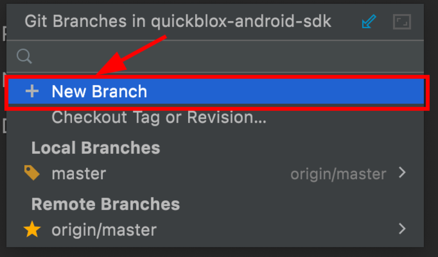
Step 2. Create A New Branch

Now you need to create a new branch where you will work on the code. This is a copy of your workspace in which you can fully work and make changes without affecting the code in the branch from which the copy was made. This allows you to isolate the workflow and not interfere with other developers working on this project.
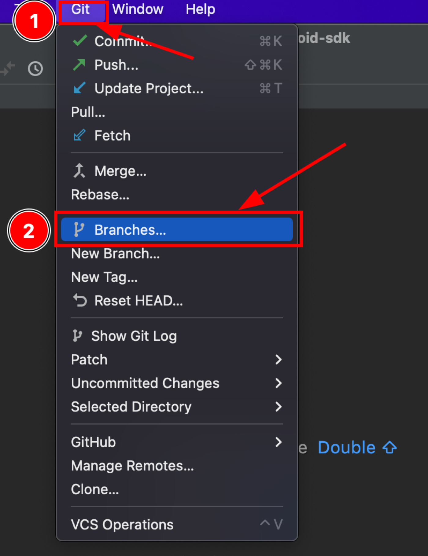
Create a new branch using Android Studio
  1. Press “Git.”
  2. Select from the drop-down list “Branches.”

This window contains a list of all local and remote branches.

Create a new branch using Android Studio

Press “New Branch

create new branch using Android Studio
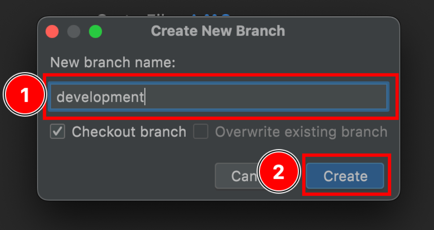
  1. Enter the name of the new branch.
  2. Press the “Create” button.

After that, Android Studio will automatically switch to the new branch.

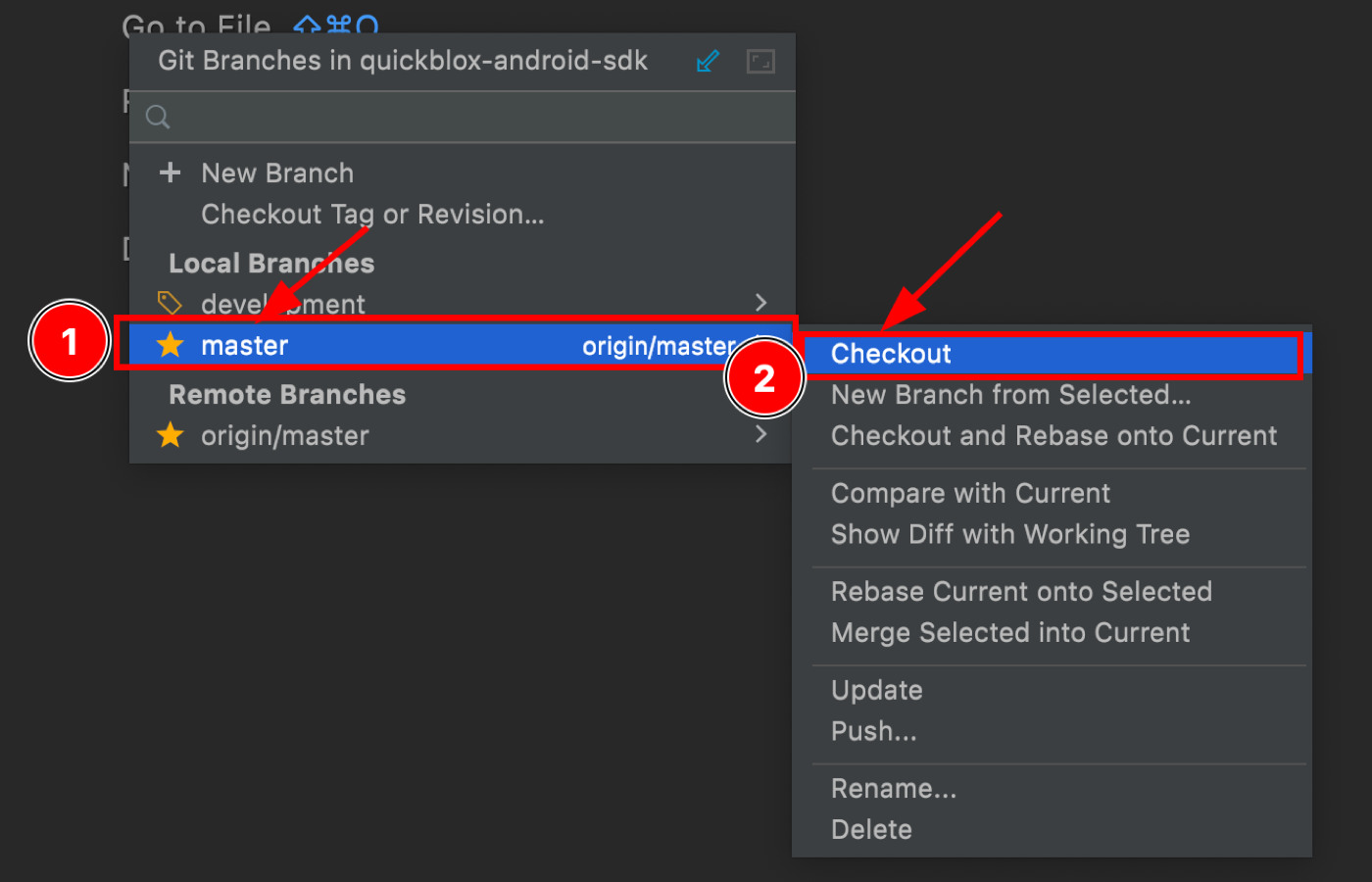
Step 3. Switch branches

To switch between branches you need to go to the window with the list of branches.

Create a new branch using Android Studio
  1. Press the “Git” button.
  2. Select from the drop-down list “Branches.”
switch branches using Android Studio
  1. Select a branch from the list and click on it.
  2. Select “Checkout” from the drop-down list.

This allows you to change the workspace to the branch of your choice.

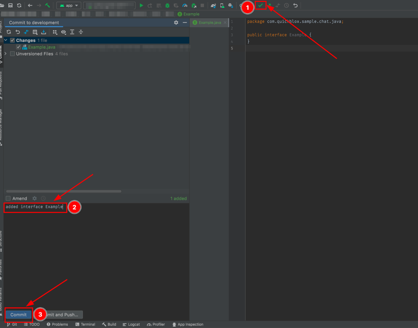
Step 4. The Commit Command

This is the command to write indexed changes to a Git repository. It saves (writes) states of the branch on the Git project timeline. The “Commit” command should be used after changing something in the project. For example, we have added a new file with the name “Example.java”, and after that, we can save changes to the local repository branch with the commit command.

use commit command in Android Studio
  1. Press the Commit command (green tick icon) on the toolbar.
  2. Provide a brief summary of the changes that were added to this commit.
  3. Press the “Commit” button.

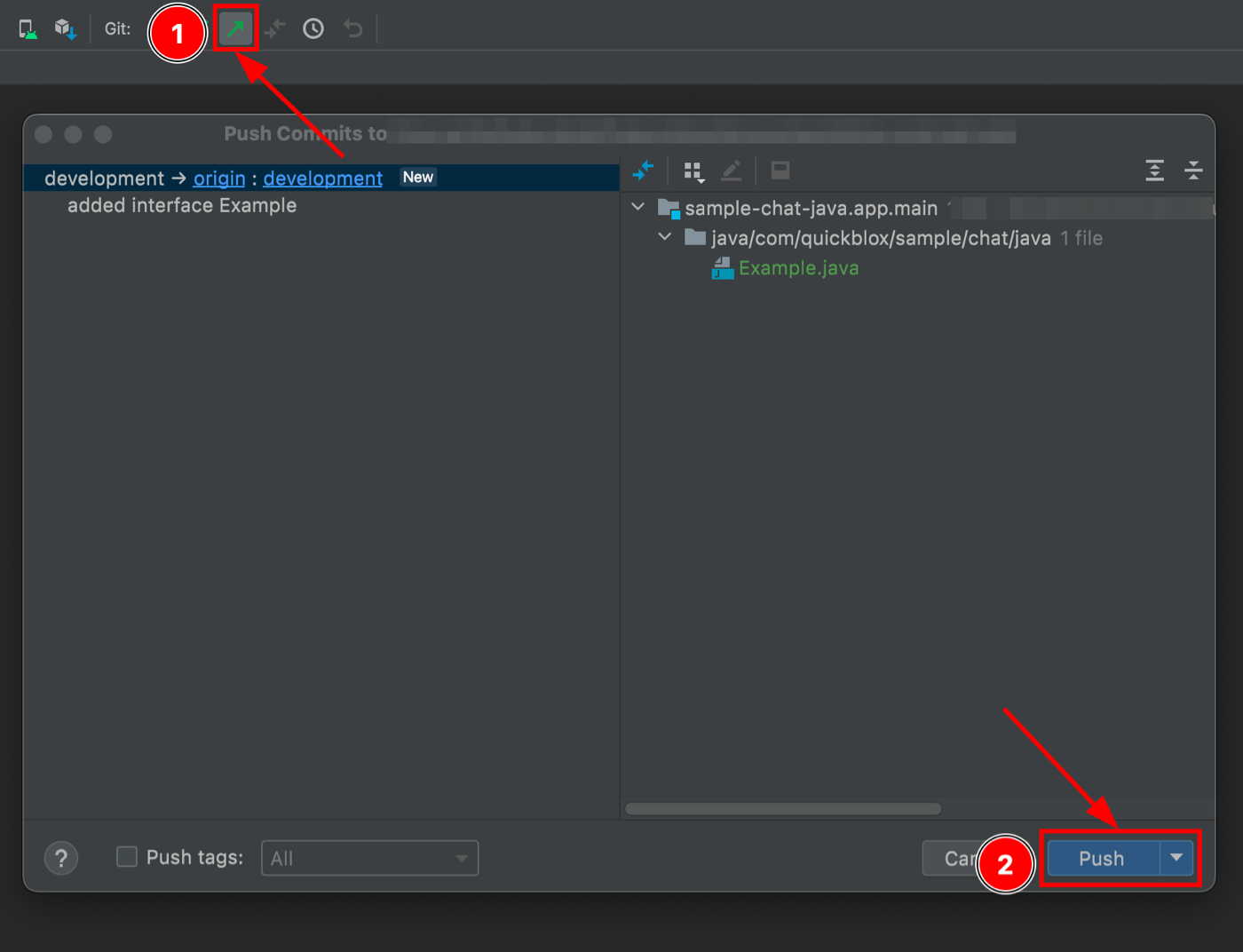
Step 5. The Push Command

The “Push” command will send the local repository branch to the remote repository. It should be used after changes have been committed to a local repository branch. The “push” command can send one or more commits.

Storing data in a remote repository allows you to access content from any computer and other developers who are working on the project can download and apply the actual code to their local repository and stay in sync with the team.

use Push command in Android Studio
  1. Press the Push command (green arrow icon) on the toolbar.
  2. Press the “Push” button.

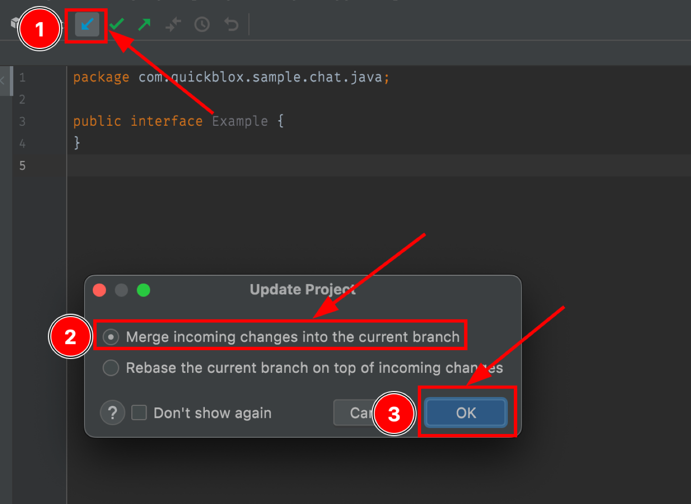
Step 6. The Pull Command

The “Pull” command is used to retrieve and download content from a remote repository branch and update the local repository branch with that content. This command can be used, for example, if another developer has made changes to the branch code and pushed the changes to a remote repository. For you to have the actual code locally, you need to synchronize your local repository branch with the remote repository branch. After the “Pull” command, the local repository branch will be the same as on the remote.

use the Pull command in Android Studio
  1. Press the Update Project command (blue arrow icon) on the toolbar.
  2. Select “Merge incoming changes into the current branch.”
  3. Press the “OK” button.

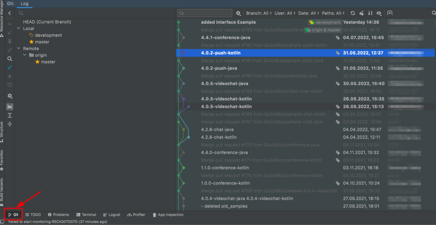
Step 7. Using the Log

You can see the history of commits by pressing on the Git in the lower left-hand corner. Here you can find when and by whom the commit was made and what changes were made.

using the log in Android Studio

Conclusion

Android Studio has native integration with Git and GitHub to allow most actions via the Android Studio UI. This makes it much easier to track and manage your Git work, which saves development time. We hope that this article will help you learn how to use basic Git commands with Android Studio so that you can clone a repository and work easily with Git. Happy coding!

This article is an implementation of an intro showcase to highlights different features of the app using Jetpack Compose. The implementation is inspired by the TapTargetView which is useful for legacy views.

The implementation is also available as a standalone library Intro-showcase-view on github which you can directly add as a gradle dependency in your project.

I have divided the implementation into byte size steps. Feel free to skip the steps that you understand or jump directly to the step you are interested in. The final implementation will look like above GIF.

Alright, let’s start coding!!

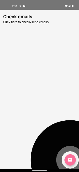
Step 1: Add a feature and draw circles on Canvas

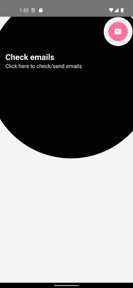
First, let’s add an email fab button aligned to the bottom of the screen.

@Composable
fun ShowcaseExample() {
val context = LocalContext.current
Box {
FloatingActionButton(
onClick = {
Toast.makeText(
context,
"Fab Clicked",
Toast.LENGTH_SHORT
).show()
},
modifier = Modifier
.align(Alignment.BottomEnd)
.padding(bottom = 16.dp, end = 16.dp),
backgroundColor = ThemeColor,
contentColor = Color.White,
elevation = FloatingActionButtonDefaults.elevation(6.dp)
) {
Icon(
Icons.Filled.Email,
contentDescription = "Email"
)
}

IntroShowCase()
}
}

Then, we’ll create two circles. We’ll use Canvas API to draw our circle.

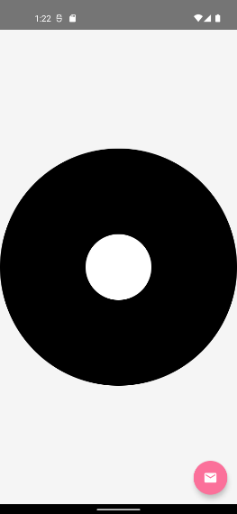
@Composable
fun IntroShowCase() {
Canvas(
modifier = Modifier
.fillMaxSize()
) {
drawCircle(
color = Color.Black
)
drawCircle(
color = Color.White,
radius = 150f
)
}
}

Pretty Simple…

But, that’s not what we want.

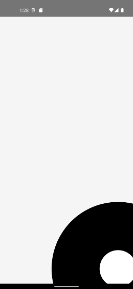
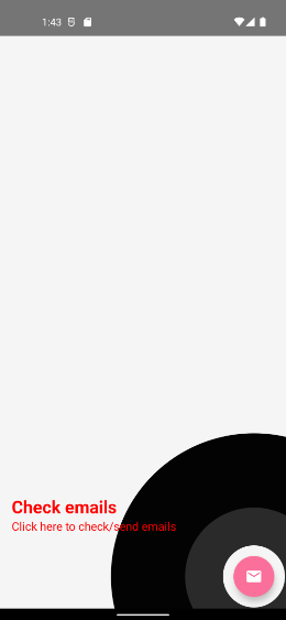
Step 2: Find LayoutCoordinates of a fab button and recenter circle.

We have to set a circle offset to highlight our Fab button. And for that, we need a position of our fab button. We’ll use OnGloballyPositionedModifier property of Modifier we’ll have view’s LayoutCoordinates in a callback.

A modifier whose onGlobalyPositioned is called with the final LayoutCoordinates of the Layout when the global position of the content may have changed. Note that it will be called after a composition when the coordinates are finalized.

Let’s modify the modifier of fab button to get its coordinates.

@Composable
fun showcaseExample() {

var target by remember {
mutableStateOf<LayoutCoordinates?>(null)
}
val
context = LocalContext.current

Box {
FloatingActionButton(
....
modifier = Modifier
.align(Alignment.BottomEnd)
.onGloballyPositioned { coordinates ->
target = coordinates
}
....

) {
....

}

target?.let {
IntroShowCase(it)
}
}
}

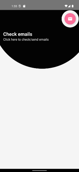
Now let’s use this coordinate to recenter our circle. Here’s how,

@Composable
fun IntroShowCase(targetCords: LayoutCoordinates) {
val targetRect = targetCords.boundsInRoot()

Canvas(
modifier = Modifier
.fillMaxSize()
) {
drawCircle(
color = Color.Black,
center = targetRect.center
)
drawCircle(
color = Color.White,
radius = 150f,
center = targetRect.center
)
}
}

We have used our target view Rect’s center offset to center our circle.

Oops!!, Where’s our fab button?. Our fab button is overlapped by circles.

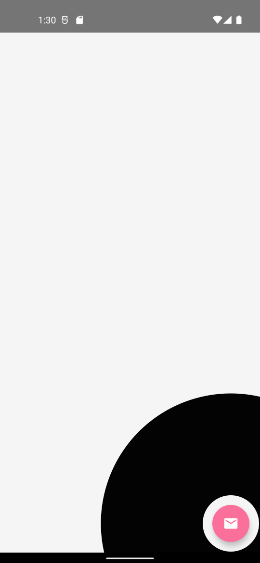
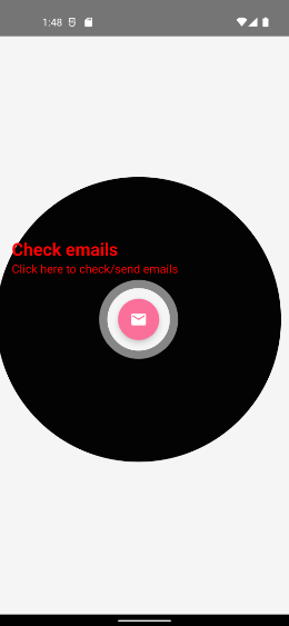
Step 3: Blend the overlapped circle to set transparency

We have to set transparency where both circles are overlapped. We’ll use BlendMode to fix this and also let’s fix the radius of the inner circle based on our target view dimension.

BlendMode.Clear : Drop both the source and destination images, leaving nothing.

@Composable
fun IntroShowCase(targetCords: LayoutCoordinates) {
val targetRect = targetCords.boundsInRoot()
val targetRadius = targetRect.maxDimension / 2f + 40f
// 40f extra traget spacing

Canvas(
modifier = Modifier
.fillMaxSize().graphicsLayer (alpha = 0.99f)
) {
drawCircle(
color = Color.Black,
center = targetRect.center
)
drawCircle(
color = Color.White,
radius = targetRadius,
center = targetRect.center,
blendMode = BlendMode.Clear
)
}
}

Perfect!! Isn’t it?

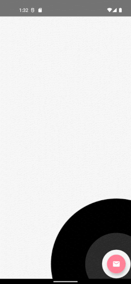
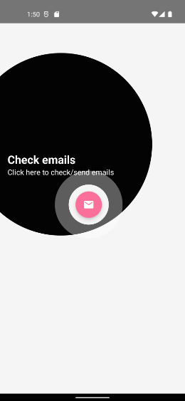
Step: 4 Add circle reveals animation to highlight target

Now, Let’s add an animation around our target view

val animationSpec = infiniteRepeatable<Float>(
animation = tween(2000, easing = FastOutLinearInEasing),
repeatMode = RepeatMode.Restart,
)
val animatables = listOf(
remember { Animatable(0f) },
remember { Animatable(0f) }
)

animatables.forEachIndexed { index, animatable ->
LaunchedEffect(animatable) {
delay(index * 1000L)
animatable.animateTo(
targetValue = 1f, animationSpec = animationSpec
)
}
}

val
dys = animatables.map { it.value }Canvas(
...
) {
...


dys.forEach { dy ->
drawCircle(
color = Color.White,
radius = targetRect.maxDimension * dy * 2f,
center = targetRect.center,
alpha = 1 - dy
)
}
...
}

Let’s try to understand this, We have used infiniteRepeatable , as we want our animation to run infinitely.

animatables is the array of Animatable, We have set up the initial delay for the second wave, We can not use delayMillis as that is considered for repeat animation as well. We just want to delay the initial animation, and then continue the loop without any delay.

we created an animation that will animate between 0 to 1 infinitely. Based on that, we have set up a radius and animated alpha between 1 to 0, which will make waves disappear at the end of an animation.

Let’s see what it look likes,

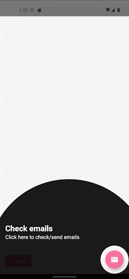
Step 5: Add texts to describe the feature

Let’s create a data class that holds the value of our targets coordinates, title, subtitle, colors, etc.

data class ShowcaseProperty(
val index: Int,
val coordinates: LayoutCoordinates,
val title: String, val subTitle: String,
val titleColor: Color = Color.White,
val subTitleColor: Color = Color.White,
)

Okay, for now, let’s ignore index field, we’ll use it later to manage the order of when we have multiple features. Let’s refactor our composable a bit.

@Composable
fun IntroShowCase(target: ShowcaseProperty) {
val targetRect = target.coordinates.boundsInRoot()
val targetRadius = targetRect.maxDimension / 2f + 40f

val animationSpec = infiniteRepeatable<Float>(
animation = tween(2000, easing = FastOutLinearInEasing),
repeatMode = RepeatMode.Restart,
)
val animatables = listOf(
remember { Animatable(0f) },
remember { Animatable(0f) }
)

animatables.forEachIndexed { index, animatable ->
LaunchedEffect(animatable) {
delay(index * 1000L)
animatable.animateTo(
targetValue = 1f, animationSpec = animationSpec
)
}
}

val
dys = animatables.map { it.value }

Box {

Canvas(
modifier = Modifier
.fillMaxSize()
.graphicsLayer(alpha = 0.99f)
) {
drawCircle(
color = Color.Black,
center = targetRect.center
)

dys.forEach { dy ->
drawCircle(
color = Color.White,
radius = targetRect.maxDimension * dy * 2f,
center = targetRect.center,
alpha = 1 - dy
)
}

drawCircle(
color = Color.White,
radius = targetRadius,
center = targetRect.center,
blendMode = BlendMode.Clear
)
}

ShowCaseText(
currentTarget = target
)
}
}@Composable
private fun ShowCaseText(
currentTarget: ShowcaseProperty,
) {

Column(modifier = Modifier
.padding(16.dp)
)
{
Text(
text = currentTarget.title,
fontSize = 24.sp,
color = currentTarget.subTitleColor,
fontWeight = FontWeight.Bold
)
Text(text = currentTarget.subTitle, fontSize = 16.sp, color = currentTarget.subTitleColor)
}
}

We just have added two Text for title and subtitle, let’s see the output.

But that’s not even near to our circles.

Step 6: Set offset of Texts

Here we need to check the top and bottom space to set up our text in free space. So we’re going to do it in onGloballyPositioned we’ll calculate the Y offset of our Text, based on total text height and the center of our target. Here’s how.

@Composable
fun IntroShowCaseEx(target: ShowcaseProperty){
....
val targetRect = target.coordinates.boundsInRoot()
val targetRadius = targetRect.maxDimension / 2f + 40f
Box {
ShowCaseText(target, targetRect, targetRadius)
}
....
}
@Composable
private fun ShowCaseText(
currentTarget: ShowcaseProperty,
targetRect: Rect,
targetRadius: Float
) {

var txtOffsetY by remember {
mutableStateOf(0f)
}

Column(modifier = Modifier
.offset(y = with(LocalDensity.current) {
txtOffsetY.toDp()
})
.onGloballyPositioned {
val
textHeight = it.size.height

val
possibleTop =
targetRect.center.y - targetRadius - textHeight

txtOffsetY = if (possibleTop > 0) {
possibleTop
} else {
targetRect.center.y + targetRadius
}
}
.padding(16.dp)
)
{
Text(
text = currentTarget.title,
fontSize = 24.sp,
color = currentTarget.subTitleColor,
fontWeight = FontWeight.Bold
)
Text(text = currentTarget.subTitle, fontSize = 16.sp, color = currentTarget.subTitleColor)
}

}

And here’s the result.

But, the Text is not in the radius of our circle.

Step 7: Calculate outer circle radius

We have to estimate the rectangle which includes our text, and our target view including its spacing.

fun getOuterRadius(textRect: Rect, targetRect: Rect): Float {

val topLeftX = min(textRect.topLeft.x, targetRect.topLeft.x)
val topLeftY = min(textRect.topLeft.y, targetRect.topLeft.y)
val bottomRightX = max(textRect.bottomRight.x, targetRect.bottomRight.x)
val bottomRightY = max(textRect.bottomRight.y, targetRect.bottomRight.y)

val expandedBounds = Rect(topLeftX, topLeftY, bottomRightX, bottomRightY)

val d = sqrt(
expandedBounds.height.toDouble().pow(2.0)
+ expandedBounds.width.toDouble().pow(2.0)
).toFloat()

return (d / 2f)
}

Okay, we just have found the rectangle of our content, and from that, we got the radius.

var textCoordinate: LayoutCoordinates? by remember {
mutableStateOf(null)
}
var
outerRadius by remember {
mutableStateOf(0f)
}
textCoordinate?.let { textCoords ->
val
textRect = textCoords.boundsInRoot()
outerRadius = getOuterRadius(textRect, targetRect) + targetRadius
}Box {
Canvas(
modifier = Modifier
.fillMaxSize()
.graphicsLayer(alpha = 0.99f)
) {
drawCircle(
color = Color.Black,
center = targetRect.center,
radius = outerRadius,
alpha = 0.9f
)

dys.forEach { dy ->
drawCircle(
color = Color.White,
radius = targetRect.maxDimension * dy * 2f,
center = targetRect.center,
alpha = 1 - dy
)
}

drawCircle(
color = Color.White,
radius = targetRadius,
center = targetRect.center,
blendMode = BlendMode.Clear
)
}

ShowCaseText(
currentTarget = target,
targetRect = targetRect,
targetRadius = targetRadius
) {
textCoordinate = it
}
}

Let’s see the result.

Nope, That’s not enough to cover the whole content.

Step 8: change the offset of our outer circle

Now, let’s find the center offset of the outer circle which includes our target and texts.

var outerOffset by remember {
mutableStateOf(Offset(0f, 0f))
}textCoordinate?.let { textCoords ->
val
textRect = textCoords.boundsInRoot()
val textHeight = textCoords.size.height

outerOffset = getOuterCircleCenter(
targetRect, textRect, targetRadius, textHeight
)

outerRadius = getOuterRadius(textRect, targetRect) + targetRadius
}Box {
Canvas(
modifier = Modifier
.fillMaxSize()
.graphicsLayer(alpha = 0.99f)
) {
drawCircle(
color = Color.Black,
center = outerOffset,
radius = outerRadius,
alpha = 0.9f
)

dys.forEach { dy ->
drawCircle(
color = Color.White,
radius = targetRect.maxDimension * dy * 2f,
center = targetRect.center,
alpha = 1 - dy
)
}

drawCircle(
color = Color.White,
radius = targetRadius,
center = targetRect.center,
blendMode = BlendMode.Clear
)
}

ShowCaseText(
currentTarget = target,
targetRect = targetRect,
targetRadius = targetRadius
) {
textCoordinate = it
}
}
fun getOuterCircleCenter(
targetBound: Rect,
textBound: Rect,
targetRadius: Float,
textHeight: Int,
): Offset {
var outerCenterX: Float
var outerCenterY: Float

val onTop =
targetBound.center.y - targetRadius - textHeight > 0

val left = min(
textBound.left,
targetBound.left - targetRadius
)
val right = max(
textBound.right,
targetBound.right + targetRadius
)

val centerY =
if (onTop) targetBound.center.y - targetRadius - textHeight
else targetBound.center.y + targetRadius + textHeight

outerCenterY = centerY
outerCenterX = (left + right) / 2

return Offset(outerCenterX, outerCenterY)
}

Looks cool!!

But what if our target is in a toolbar or bottom bar? Let’s see by changing the alignment of our fab button to TopEnd .

Not so perfect!!.

Step 9: Fix the outer circle center point for the Top and Bottom bar.

We have to recheck our center point of an outer circle when our target is in the toolbar or at the bottom of the screen.

Here’s how

val topArea = 88.dp
val screenHeight = LocalConfiguration.current.screenHeightDp
val
yOffset = with(LocalDensity.current) {
target.coordinates.positionInRoot().y.toDp()
}var outerOffset by remember {
mutableStateOf(Offset(0f, 0f))
}textCoordinate?.let { textCoords ->
val
textRect = textCoords.boundsInRoot()
val textHeight = textCoords.size.height
val
isInGutter = topArea > yOffset || yOffset > screenHeight.dp.minus(topArea)

outerOffset = getOuterCircleCenter(
targetRect, textRect, targetRadius, textHeight, isInGutter
)

outerRadius = getOuterRadius(textRect, targetRect) + targetRadius
}....fun getOuterCircleCenter(
targetBound: Rect,
textBound: Rect,
targetRadius: Float,
textHeight: Int,
isInGutter: Boolean,
): Offset {
var outerCenterX: Float
var outerCenterY: Float

val onTop =
targetBound.center.y - targetRadius - textHeight > 0

val left = min(
textBound.left,
targetBound.left - targetRadius
)
val right = max(
textBound.right,
targetBound.right + targetRadius
)

val centerY =
if (onTop) targetBound.center.y - targetRadius - textHeight
else targetBound.center.y + targetRadius + textHeight

outerCenterY = centerY
outerCenterX = (left + right) / 2

if (isInGutter) {
outerCenterY = targetBound.center.y
}

return Offset(outerCenterX, outerCenterY)
}

If our target is in Gutter we just set targetBound.center.y to outerCenterY and our outerCenterX would be the same as the center X of our content rectangle in both cases.

Let’s check the output now.

Perfect!!

And last but not least…

Step 10: Add circle reveals animation to our outer circle.

val outerAnimatable = remember { Animatable(0.6f) }

LaunchedEffect(target) {
outerAnimatable.snapTo(0.6f)

outerAnimatable.animateTo(
targetValue = 1f,
animationSpec = tween(
durationMillis = 500,
easing = FastOutSlowInEasing,
),
)
}

We have created Animatable with initial value 0.6 as we don’t want our circle to scale from 0.0. If you notice, we have used target here as a key of LaunchedEffect , this will only trigger the inner block when a key changes. Whenever key changes we have reset the current value to the initial value 0.6f using snapTo. Let’s use Animatable value with our outer circle radius.

Box {
Canvas(
modifier = Modifier
.fillMaxSize()
.graphicsLayer(alpha = 0.99f)
) {
drawCircle(
color = Color.Black,
center = outerOffset,
radius = outerRadius * outerAnimatable.value,
alpha = 0.9f
)
}
}

Okay, here’s the result

That’s it!!

Now let’s integrate it with multiple feature showcases. We’re not going to cover all the basic details.onGloballyPositioned may call multiple times so we’ll use an mutableStateMapOf of ShowcaseProperty to avoid duplications.

@Composable
fun ShowcaseSample() {
val targets = remember {
mutableStateMapOf<String, ShowcaseProperty>()
}

Box {
FloatingActionButton(
onClick = {},
modifier = Modifier
.padding(16.dp)
.align(Alignment.BottomEnd)
.onGloballyPositioned { coordinates ->
targets["email"] = ShowcaseProperty(
1, coordinates,
"Check emails", "Click here to check/send emails"
)
},
backgroundColor = ThemeColor,
contentColor = Color.White,
elevation = FloatingActionButtonDefaults.elevation(6.dp)
) {
Icon(
Icons.Filled.Email,
contentDescription = "Email"
)
}
Button(
onClick = {},
modifier = Modifier
.align(Alignment.BottomStart)
.padding(start = 16.dp, bottom = 16.dp)
.onGloballyPositioned { coordinates ->
targets["follow"] = ShowcaseProperty(
2, coordinates,
"Follow me", "Click here to follow"
)
}
) {
Text(text = "Follow")
}


IntroShowCase(targets)
}
}

And Here’s our Intro showcase view

@Composable
fun IntroShowCase(
targets: SnapshotStateMap<String, ShowcaseProperty>,
backgroundColor: Color = Color.Black,
onShowcaseCompleted: () -> Unit
) {
val uniqueTargets = targets.values.sortedBy { it.index }
var
currentTargetIndex by remember { mutableStateOf(0) }

val
currentTarget =
if (uniqueTargets.isNotEmpty() && currentTargetIndex < uniqueTargets.size) uniqueTargets[currentTargetIndex] else null


currentTarget?.let {
TargetContent(it, backgroundColor) {
if
(++currentTargetIndex >= uniqueTargets.size) {
onShowcaseCompleted()
}
}
}
}

Pretty simple!!

Similarly, you can add rest of the views as aShowcaseProperty to make it look like the video shown at the beginning of the article. Full source code is available here.

As I mentioned earlier, the implementation is also available as a library, which you can integrate easily. Feel free to use it in your app and if you want to customize it you’re free to fork.

Here’s an example of an Android application that allows users to choose an image from the camera or gallery and perform cropping functionality using the “Android Image Cropper” library.

Step 1: Set up the project

Start by creating a new Android project in Android Studio. Make sure you have the necessary dependencies and permissions in your project’s build.gradle file:

dependencies {
    implementation 'com.theartofdev.edmodo:android-image-cropper:2.8.+'
}

Also, make sure you have the necessary permissions in your AndroidManifest.xml file:

<uses-permission android:name="android.permission.READ_EXTERNAL_STORAGE" />
<uses-permission android:name="android.permission.WRITE_EXTERNAL_STORAGE" />
<uses-permission android:name="android.permission.CAMERA" />

Step 2: Create the layout

Create a layout file called activity_main.xml with the following code:

<RelativeLayout xmlns:android="http://schemas.android.com/apk/res/android"
    xmlns:tools="http://schemas.android.com/tools"
    android:layout_width="match_parent"
    android:layout_height="match_parent"
    android:paddingLeft="16dp"
    android:paddingTop="16dp"
    android:paddingRight="16dp"
    android:paddingBottom="16dp"
    tools:context=".MainActivity">

    <ImageView
        android:id="@+id/imageView"
        android:layout_width="match_parent"
        android:layout_height="wrap_content"
        android:adjustViewBounds="true"
        android:scaleType="centerInside"
        android:src="@drawable/placeholder" />

    <Button
        android:id="@+id/btnChooseImage"
        android:layout_width="wrap_content"
        android:layout_height="wrap_content"
        android:layout_below="@id/imageView"
        android:text="Choose Image" />

    <Button
        android:id="@+id/btnCropImage"
        android:layout_width="wrap_content"
        android:layout_height="wrap_content"
        android:layout_below="@id/btnChooseImage"
        android:text="Crop Image"
        android:enabled="false" />

</RelativeLayout>

Step 3: Implement the functionality in the MainActivity

Open MainActivity.java and add the following code:

import android.Manifest;
import android.content.Intent;
import android.content.pm.PackageManager;
import android.graphics.Bitmap;
import android.net.Uri;
import android.os.Bundle;
import android.provider.MediaStore;
import android.view.View;
import android.widget.Button;
import android.widget.ImageView;

import androidx.annotation.NonNull;
import androidx.appcompat.app.AppCompatActivity;
import androidx.core.app.ActivityCompat;
import androidx.core.content.ContextCompat;

import com.theartofdev.edmodo.cropper.CropImage;
import com.theartofdev.edmodo.cropper.CropImageView;

import java.io.IOException;

public class MainActivity extends AppCompatActivity {

    private static final int REQUEST_CAMERA_PERMISSION = 200;
    private static final int REQUEST_IMAGE_CAPTURE = 100;
    private static final int REQUEST_IMAGE_GALLERY = 101;

    private ImageView imageView;
    private Button btnChooseImage;
    private Button btnCropImage;

    private Uri imageUri;

    @Override
    protected void onCreate(Bundle savedInstanceState) {
        super.onCreate(savedInstanceState);
        setContentView(R.layout.activity_main);

        imageView = findViewById(R.id.imageView);
        btnChooseImage = findViewById(R.id.btnChooseImage);
        btnCropImage = findViewById(R.id.btnCropImage);

        btnChooseImage.setOnClickListener(new View.OnClickListener() {
            @Override
            public void onClick(View v) {
                chooseImage();
            }
        });

        btnCropImage.setOnClickListener(new View.OnClickListener() {
            @Override
            public void onClick(View v) {
                cropImage(imageUri);
            }
        });
    }

    private void chooseImage() {
        if (ContextCompat.checkSelfPermission(this, Manifest.permission.CAMERA) != PackageManager.PERMISSION_GRANTED) {
            ActivityCompat.requestPermissions(this, new String[]{Manifest.permission.CAMERA}, REQUEST_CAMERA_PERMISSION);
        } else {
            openImageChooser();
        }
    }

    private void openImageChooser() {
        Intent intent = new Intent(Intent.ACTION_GET_CONTENT);
        intent.setType("image/*");
        startActivityForResult(intent, REQUEST_IMAGE_GALLERY);
    }

    private void cropImage(Uri imageUri) {
        CropImage.activity(imageUri)
                .setGuidelines(CropImageView.Guidelines.ON)
                .setAspectRatio(1, 1)
                .start(this);
    }

    @Override
    protected void onActivityResult(int requestCode, int resultCode, Intent data) {
        super.onActivityResult(requestCode, resultCode, data);

        if (requestCode == REQUEST_IMAGE_CAPTURE && resultCode == RESULT_OK) {
            cropImage(imageUri);
        } else if (requestCode == REQUEST_IMAGE_GALLERY && resultCode == RESULT_OK && data != null) {
            try {
                Bitmap bitmap = MediaStore.Images.Media.getBitmap(getContentResolver(), data.getData());
                imageView.setImageBitmap(bitmap);
                imageUri = data.getData();
                btnCropImage.setEnabled(true);
            } catch (IOException e) {
                e.printStackTrace();
            }
        } else if (requestCode == CropImage.CROP_IMAGE_ACTIVITY_REQUEST_CODE) {
            CropImage.ActivityResult result = CropImage.getActivityResult(data);
            if (resultCode == RESULT_OK) {
                Uri resultUri = result.getUri();
                try {
                    Bitmap croppedBitmap = MediaStore.Images.Media.getBitmap(getContentResolver(), resultUri);
                    imageView.setImageBitmap(croppedBitmap);
                } catch (IOException e) {
                    e.printStackTrace();
                }
            } else if (resultCode == CropImage.CROP_IMAGE_ACTIVITY_RESULT_ERROR_CODE) {
                Exception error = result.getError();
                error.printStackTrace();
            }
        }
    }

    @Override
    public void onRequestPermissionsResult(int requestCode, @NonNull String[] permissions, @NonNull int[] grantResults) {
        super.onRequestPermissionsResult(requestCode, permissions, grantResults);
        if (requestCode == REQUEST_CAMERA_PERMISSION && grantResults.length > 0 && grantResults[0] == PackageManager.PERMISSION_GRANTED) {
            openImageChooser();
        }
    }
}

That’s it! Now you have an Android application that allows users to choose an image from the camera or gallery and perform cropping functionality. Remember to replace the placeholder image with an actual placeholder image of your choice.

Note: Don’t forget to add the necessary runtime permissions check in your code to handle permissions for accessing the camera and gallery.

Android studio XML, Kotlin payment app ui with complete source code for free by Vishal Swami. Ideal for payment apps, homepage design templates etc.


GitHub Link:- https://github.com/vishaldroidx/PaymentAppUI-Android

Credits:

 © All contents from GitHub
AuthorVishal Swami

If you like this post, please leave your suggestions and comments below 

Did you know? 
your comments can motivate us to create wonders.

Classroom UI Android studio project by Shashank Singhal. Ideal template for edutech, e-commerce, listing, and social media applications.

Author

Author Name:- Vishal Swami
GitHub Link:- https://github.com/vishaldroidx

Credits:

 © All contents from GitHub
AuthorVishal Swami

If you like this post, please leave your suggestions and comments below 

Did you know? 
your comments can motivate us to create wonders.

Android Bottom Navigation stays at the bottom of the screen providing navigation between top-level views in the app. This is introduced in design support library with backward compatibility. Bottom Navigation should be used when the app has three to five top-level navigations.

This article explains the basics of Bottom Navigation, combining it with Fragments. We also going to learn how to load the first fragment with grid data (using RecyclerView) by fetching JSON through HTTP call.

1. Bottom Navigation

The Bottom Navigation can be easily added using BottomNavigationView component. You have to use gravitation or relative attributes to make it appear at the bottom of the screen.

<?xml version="1.0" encoding="utf-8"?>
<android.support.design.widget.CoordinatorLayout xmlns:android="http://schemas.android.com/apk/res/android"
    xmlns:app="http://schemas.android.com/apk/res-auto"
    xmlns:tools="http://schemas.android.com/tools">
 
    <FrameLayout
        android:id="@+id/frame_container"
        android:layout_width="match_parent"
        android:layout_height="match_parent"
        app:layout_behavior="@string/appbar_scrolling_view_behavior" />
 
    <android.support.design.widget.BottomNavigationView
        android:id="@+id/navigation"
        android:layout_width="match_parent"
        android:layout_height="wrap_content"
        android:layout_gravity="bottom"
        android:background="?android:attr/windowBackground"
        app:itemBackground="@color/bgBottomNavigation"
        android:foreground="?attr/selectableItemBackground"
        app:itemIconTint="@android:color/white"
        app:itemTextColor="@android:color/white"
        app:menu="@menu/navigation" />
 
</android.support.design.widget.CoordinatorLayout>

Here few important attributes have to noted down.

app:menu — The menu resource file to display the navigation items along with icon and text.
app:itemBackground — Applies background color to bottom navigation.
app:itemTextColor — The text color of bottom navigation item.
app:itemIconTint — The icon color of bottom navigation item.

When to use Bottom Navigation?
As per the design specs, the below navigations should be used depending on the criteria.

> Navigation Drawer – Use when top-level navigation has more than six destinations.

> Tabs – Use when there are two navigational destinations.

> Bottom Navigation – Use when there are three to five top-level destinations.

Before going further, have a quick look at the design specifications of Bottom Navigation.

Now let’s try it by creating a new project in Android Studio.

2. Creating New Project

1. Create a new project in Android Studio from File ⇒ New Project and select Basic Activity from templates.

2. Download this res folder and add the drawables to your project’s res. This folder contains necessary drawables required for bottom navigation items.

3. Make sure you have design support library in your build.gradle.

build.gradle
dependencies {
    implementation 'com.android.support:design:26.1.0'
}

4. Add below color, string values to your colors.xml and strings.xml.

colors.xml
<?xml version="1.0" encoding="utf-8"?>
<resources>
    <color name="colorPrimary">#7b4bff</color>
    <color name="colorPrimaryDark">#6539ba</color>
    <color name="colorAccent">#FF4081</color>
    <color name="bgBottomNavigation">#fe485a</color>
</resources>
strings.xml
<resources>
    <string name="app_name">Bottom Navigation</string>
    <string name="title_shop">Shop</string>
    <string name="title_gifts">Gifts</string>
    <string name="title_cart">Cart</string>
    <string name="title_profile">Profile</string>
</resources>

5. As the Bottom Navigation items rendered using a menu file, create a new xml named navigation.xml under res ⇒ menu folder.

navigation.xml
<?xml version="1.0" encoding="utf-8"?>
<menu xmlns:android="http://schemas.android.com/apk/res/android">
 
    <item
        android:id="@+id/navigation_shop"
        android:icon="@drawable/ic_store_white_24dp"
        android:title="@string/title_shop" />
 
    <item
        android:id="@+id/navigation_gifts"
        android:icon="@drawable/ic_card_giftcard_white_24dp"
        android:title="@string/title_gifts" />
 
    <item
        android:id="@+id/navigation_cart"
        android:icon="@drawable/ic_shopping_cart_white_24dp"
        android:title="@string/title_cart" />
 
    <item
        android:id="@+id/navigation_profile"
        android:icon="@drawable/ic_person_white_24dp"
        android:title="@string/title_profile" />
 
</menu>

6. Open the layout file of main activity i.e activity_main.xml and add BottomNavigationView widget. Here we are also adding a FrameLayout to load the Fragments when the navigation item is selected.

activity_main.xml
<?xml version="1.0" encoding="utf-8"?>
<android.support.design.widget.CoordinatorLayout xmlns:android="http://schemas.android.com/apk/res/android"
    xmlns:app="http://schemas.android.com/apk/res-auto"
    xmlns:tools="http://schemas.android.com/tools"
    android:id="@+id/container"
    android:layout_width="match_parent"
    android:layout_height="match_parent"
    tools:context="info.androidhive.bottomnavigation.MainActivity">
 
    <FrameLayout
        android:id="@+id/frame_container"
        android:layout_width="match_parent"
        android:layout_height="match_parent"
        app:layout_behavior="@string/appbar_scrolling_view_behavior" />
 
    <android.support.design.widget.BottomNavigationView
        android:id="@+id/navigation"
        android:layout_width="match_parent"
        android:layout_height="wrap_content"
        android:layout_gravity="bottom"
        android:background="?android:attr/windowBackground"
        app:itemBackground="@color/bgBottomNavigation"
        android:foreground="?attr/selectableItemBackground"
        app:itemIconTint="@android:color/white"
        app:itemTextColor="@android:color/white"
        app:menu="@menu/navigation" />
 
</android.support.design.widget.CoordinatorLayout>

7. Now open MainActivity.java and modify it as below.

> Here, OnNavigationItemSelectedListener will be called when the bottom navigation item is selected. For now we are just changing the toolbar title upon selecting the navigation item.

MainActivity.java
package info.androidhive.bottomnavigation;
 
import android.os.Bundle;
import android.support.annotation.NonNull;
import android.support.design.widget.BottomNavigationView;
import android.support.design.widget.CoordinatorLayout;
import android.support.v4.app.Fragment;
import android.support.v4.app.FragmentTransaction;
import android.support.v7.app.ActionBar;
import android.support.v7.app.AppCompatActivity;
import android.view.MenuItem;
 
import info.androidhive.bottomnavigation.fragment.CartFragment;
import info.androidhive.bottomnavigation.fragment.GiftsFragment;
import info.androidhive.bottomnavigation.fragment.ProfileFragment;
import info.androidhive.bottomnavigation.fragment.StoreFragment;
import info.androidhive.bottomnavigation.helper.BottomNavigationBehavior;
 
public class MainActivity extends AppCompatActivity {
 
    private ActionBar toolbar;
 
    @Override
    protected void onCreate(Bundle savedInstanceState) {
        super.onCreate(savedInstanceState);
        setContentView(R.layout.activity_main);
 
        toolbar = getSupportActionBar();
 
        BottomNavigationView navigation = (BottomNavigationView) findViewById(R.id.navigation);
        navigation.setOnNavigationItemSelectedListener(mOnNavigationItemSelectedListener);
 
        toolbar.setTitle("Shop");
    }
 
    private BottomNavigationView.OnNavigationItemSelectedListener mOnNavigationItemSelectedListener
            = new BottomNavigationView.OnNavigationItemSelectedListener() {
 
        @Override
        public boolean onNavigationItemSelected(@NonNull MenuItem item) {
            Fragment fragment;
            switch (item.getItemId()) {
                case R.id.navigation_shop:
                    toolbar.setTitle("Shop");
                    return true;
                case R.id.navigation_gifts:
                    toolbar.setTitle("My Gifts");
                    return true;
                case R.id.navigation_cart:
                    toolbar.setTitle("Cart");
                    return true;
                case R.id.navigation_profile:
                    toolbar.setTitle("Profile");
                    return true;
            }
            return false;
        }
    };
}

If you run the app, you can see the bottom navigation displayed as shown below.

3. Adding Fragments

As we have the Bottom Navigation ready, let’s see how to switch views when the navigation menu item is selected. This can be done easily by using the Fragments.

Note: ViewPager shouldn’t be used when using Bottom Navigation as per design specs (Avoid using lateral motion to transition between views)

I am creating four fragments named StoreFragmentGiftsFragmentCartFragment and ProfileFragment.

8. Create new Fragment by going to File ⇒ New ⇒ Fragment ⇒ Fragment (Blank) and name it as StoreFragment.java. Likewise create other three fragments too.

9. Open MainActivity.java and modify bottom navigation listener as below to load the fragments in FrameLayout.

> loadFragment() – loads the Fragment into FrameLayout. The same method is called in OnNavigationItemSelectedListener callback by passing appropriate fragment instance.
> The logic needed for specific module goes into appropriate Fragment keeping the MainActivity clean.

MainActivity.java
package info.androidhive.bottomnavigation;
 
import android.os.Bundle;
import android.support.annotation.NonNull;
import android.support.design.widget.BottomNavigationView;
import android.support.design.widget.CoordinatorLayout;
import android.support.v4.app.Fragment;
import android.support.v4.app.FragmentTransaction;
import android.support.v7.app.ActionBar;
import android.support.v7.app.AppCompatActivity;
import android.view.MenuItem;
 
import info.androidhive.bottomnavigation.fragment.CartFragment;
import info.androidhive.bottomnavigation.fragment.GiftsFragment;
import info.androidhive.bottomnavigation.fragment.ProfileFragment;
import info.androidhive.bottomnavigation.fragment.StoreFragment;
import info.androidhive.bottomnavigation.helper.BottomNavigationBehavior;
 
public class MainActivity extends AppCompatActivity {
 
    private ActionBar toolbar;
 
    @Override
    protected void onCreate(Bundle savedInstanceState) {
        super.onCreate(savedInstanceState);
        setContentView(R.layout.activity_main);
 
        toolbar = getSupportActionBar();
 
        // load the store fragment by default
        toolbar.setTitle("Shop");
        loadFragment(new StoreFragment());
    }
 
    private BottomNavigationView.OnNavigationItemSelectedListener mOnNavigationItemSelectedListener
            = new BottomNavigationView.OnNavigationItemSelectedListener() {
 
        @Override
        public boolean onNavigationItemSelected(@NonNull MenuItem item) {
            Fragment fragment;
            switch (item.getItemId()) {
                case R.id.navigation_shop:
                    toolbar.setTitle("Shop");
                    fragment = new StoreFragment();
                    loadFragment(fragment);
                    return true;
                case R.id.navigation_gifts:
                    toolbar.setTitle("My Gifts");
                    fragment = new GiftsFragment();
                    loadFragment(fragment);
                    return true;
                case R.id.navigation_cart:
                    toolbar.setTitle("Cart");
                    fragment = new CartFragment();
                    loadFragment(fragment);
                    return true;
                case R.id.navigation_profile:
                    toolbar.setTitle("Profile");
                    fragment = new ProfileFragment();
                    loadFragment(fragment);
                    return true;
            }
 
            return false;
        }
    };
 
    private void loadFragment(Fragment fragment) {
        // load fragment
        FragmentTransaction transaction = getSupportFragmentManager().beginTransaction();
        transaction.replace(R.id.frame_container, fragment);
        transaction.addToBackStack(null);
        transaction.commit();
    }
 
}

Now if you run the project you can see the fragments loaded when navigation is selected.

4. Implementing ShopFragment – Displaying Items in Grid

Now we’ll see how to implement the first fragment i.e ShopFragment which displays the shop items in a Grid fashion. For demonstration, I have created a sample json which contains few movies for sale. To implement this, all we have to do is, fetch json and display the data in RecyclerView in a grid format. To make the task simpler, follow my other article which explains the same.

10. Open build.gradle and add RecyclerViewCardViewVolley and Glide dependencies.

build.gradle
dependencies {
    // RecyclerView
    compile 'com.android.support:recyclerview-v7:26.1.0'
 
    // CardView
    compile 'com.android.support:cardview-v7:26.1.0'
 
    // volley http library
    implementation 'com.android.volley:volley:1.0.0'
    implementation 'com.google.code.gson:gson:2.6.2'
 
    // glide image library
    implementation 'com.github.bumptech.glide:glide:4.3.1'
}

11. Create a class named MyApplication.java implement the class from Application. This is a singleton class in which volley library will be initiated.

MyApplication.java
package info.androidhive.bottomnavigation.app;
 
import android.app.Application;
import android.text.TextUtils;
 
import com.android.volley.Request;
import com.android.volley.RequestQueue;
import com.android.volley.toolbox.Volley;
 
public class MyApplication extends Application {
 
    public static final String TAG = MyApplication.class
            .getSimpleName();
 
    private RequestQueue mRequestQueue;
 
    private static MyApplication mInstance;
 
    @Override
    public void onCreate() {
        super.onCreate();
        mInstance = this;
    }
 
    public static synchronized MyApplication getInstance() {
        return mInstance;
    }
 
    public RequestQueue getRequestQueue() {
        if (mRequestQueue == null) {
            mRequestQueue = Volley.newRequestQueue(getApplicationContext());
        }
 
        return mRequestQueue;
    }
 
    public <T> void addToRequestQueue(Request<T> req, String tag) {
        // set the default tag if tag is empty
        req.setTag(TextUtils.isEmpty(tag) ? TAG : tag);
        getRequestQueue().add(req);
    }
 
    public <T> void addToRequestQueue(Request<T> req) {
        req.setTag(TAG);
        getRequestQueue().add(req);
    }
 
    public void cancelPendingRequests(Object tag) {
        if (mRequestQueue != null) {
            mRequestQueue.cancelAll(tag);
        }
    }
}

12. Open AndroidManifest.xml and add MyApplication to <application> tag. We also need INTERNET permission as we gonna make http calls.

AndroidManifest.xml
<?xml version="1.0" encoding="utf-8"?>
<manifest xmlns:android="http://schemas.android.com/apk/res/android"
    package="info.androidhive.bottomnavigation">
 
    <uses-permission android:name="android.permission.INTERNET"/>
 
    <application
        android:name=".app.MyApplication"
        android:allowBackup="true"
        android:icon="@mipmap/ic_launcher"
        android:label="@string/app_name"
        android:roundIcon="@mipmap/ic_launcher_round"
        android:supportsRtl="true"
        android:theme="@style/AppTheme">
        <activity
            android:name=".MainActivity"
            android:label="@string/app_name">
            <intent-filter>
                <action android:name="android.intent.action.MAIN" />
 
                <category android:name="android.intent.category.LAUNCHER" />
            </intent-filter>
        </activity>
    </application>
</manifest>

13. Open the layout file of StoreFragment i.e fragment_store.xml and add below layout code. Here we are adding the RecyclerView component.

fragment_store.xml
<android.support.v4.widget.NestedScrollView xmlns:android="http://schemas.android.com/apk/res/android"
    xmlns:tools="http://schemas.android.com/tools"
    android:layout_width="match_parent"
    android:layout_height="match_parent"
    android:background="#f1f5f7"
    tools:context="info.androidhive.bottomnavigation.fragment.StoreFragment">
 
    <LinearLayout
        android:layout_width="match_parent"
        android:layout_height="match_parent"
        android:orientation="vertical">
 
        <TextView
            android:layout_width="match_parent"
            android:layout_height="wrap_content"
            android:paddingLeft="@dimen/activity_horizontal_margin"
            android:paddingTop="10dp"
            android:text="New Release Films"
            android:textColor="#111"
            android:textSize="16dp" />
 
        <android.support.v7.widget.RecyclerView
            android:id="@+id/recycler_view"
            android:layout_width="match_parent"
            android:layout_height="wrap_content"
            android:clipToPadding="false"
            android:scrollbars="vertical" />
    </LinearLayout>
</android.support.v4.widget.NestedScrollView>

14. Create an xml layout named store_item_row.xml under res ⇒ layout. This layout file will be used in RecyclerView adapter class to render single item.

store_item_row.xml
<LinearLayout xmlns:android="http://schemas.android.com/apk/res/android"
    xmlns:card_view="http://schemas.android.com/apk/res-auto"
    android:layout_width="match_parent"
    android:layout_height="wrap_content">
 
    <android.support.v7.widget.CardView
        android:id="@+id/card_view"
        android:layout_width="match_parent"
        android:layout_height="match_parent"
        android:layout_gravity="center"
        android:layout_margin="@dimen/card_margin"
        android:clickable="true"
        android:elevation="3dp"
        android:foreground="?attr/selectableItemBackground"
        card_view:cardCornerRadius="@dimen/card_album_radius">
 
        <RelativeLayout
            android:layout_width="match_parent"
            android:layout_height="match_parent">
 
            <ImageView
                android:id="@+id/thumbnail"
                android:layout_width="match_parent"
                android:layout_height="@dimen/album_cover_height"
                android:background="?attr/selectableItemBackgroundBorderless"
                android:clickable="true"
                android:scaleType="fitXY" />
 
            <TextView
                android:id="@+id/title"
                android:layout_width="match_parent"
                android:layout_height="wrap_content"
                android:layout_below="@id/thumbnail"
                android:lines="2"
                android:paddingLeft="@dimen/album_title_padding"
                android:paddingRight="@dimen/album_title_padding"
                android:paddingTop="@dimen/album_title_padding"
                android:textColor="#111"
                android:textSize="11dp" />
 
            <TextView
                android:id="@+id/price"
                android:layout_width="match_parent"
                android:layout_height="wrap_content"
                android:layout_below="@id/title"
                android:layout_marginRight="10dp"
                android:gravity="right"
                android:paddingBottom="@dimen/songs_count_padding_bottom"
                android:textColor="@color/colorAccent"
                android:textSize="11dp" />
 
        </RelativeLayout>
 
    </android.support.v7.widget.CardView>
</LinearLayout>

15. Create a class named Movie.java. This POJO class will be useful while parsing the json.

Movie.java
package info.androidhive.bottomnavigation;
 
public class Movie {
    String title;
    String image;
    String price;
 
    public String getTitle() {
        return title;
    }
 
    public void setTitle(String title) {
        this.title = title;
    }
 
    public String getImage() {
        return image;
    }
 
    public void setImage(String image) {
        this.image = image;
    }
 
    public String getPrice() {
        return price;
    }
 
    public void setPrice(String price) {
        this.price = price;
    }
}

16. Now open StoreFragment.java and add below code. For simplicity the RecyclerView adapter class StoreAdapter included in the same fragment.

> fetchStoreItems() Method fetches the movies json using Volley and serializes it using Gson.

> StoreAdapter class renders the movies in RecyclerView.

StoreFragment.java
package info.androidhive.bottomnavigation.fragment;
 
 
import android.content.Context;
import android.content.res.Resources;
import android.graphics.Rect;
import android.os.Bundle;
import android.support.v4.app.Fragment;
import android.support.v7.widget.DefaultItemAnimator;
import android.support.v7.widget.GridLayoutManager;
import android.support.v7.widget.RecyclerView;
import android.util.Log;
import android.util.TypedValue;
import android.view.LayoutInflater;
import android.view.View;
import android.view.ViewGroup;
import android.widget.ImageView;
import android.widget.TextView;
import android.widget.Toast;
 
import com.android.volley.Response;
import com.android.volley.VolleyError;
import com.android.volley.toolbox.JsonArrayRequest;
import com.bumptech.glide.Glide;
import com.google.gson.Gson;
import com.google.gson.reflect.TypeToken;
 
import org.json.JSONArray;
 
import java.util.ArrayList;
import java.util.List;
 
import info.androidhive.bottomnavigation.Movie;
import info.androidhive.bottomnavigation.app.MyApplication;
import info.androidhive.bottomnavigation.R;
 
public class StoreFragment extends Fragment {
 
    private static final String TAG = StoreFragment.class.getSimpleName();
    private static final String URL = "https://api.androidhive.info/json/movies_2017.json";
 
    private RecyclerView recyclerView;
    private List<Movie> movieList;
    private StoreAdapter mAdapter;
 
    public StoreFragment() {
        // Required empty public constructor
    }
 
    public static StoreFragment newInstance(String param1, String param2) {
        StoreFragment fragment = new StoreFragment();
        Bundle args = new Bundle();
        fragment.setArguments(args);
        return fragment;
    }
 
    @Override
    public void onCreate(Bundle savedInstanceState) {
        super.onCreate(savedInstanceState);
    }
 
    @Override
    public View onCreateView(LayoutInflater inflater, ViewGroup container,
                             Bundle savedInstanceState) {
        // Inflate the layout for this fragment
        View view = inflater.inflate(R.layout.fragment_store, container, false);
 
        recyclerView = view.findViewById(R.id.recycler_view);
        movieList = new ArrayList<>();
        mAdapter = new StoreAdapter(getActivity(), movieList);
 
        RecyclerView.LayoutManager mLayoutManager = new GridLayoutManager(getActivity(), 3);
        recyclerView.setLayoutManager(mLayoutManager);
        recyclerView.addItemDecoration(new GridSpacingItemDecoration(2, dpToPx(8), true));
        recyclerView.setItemAnimator(new DefaultItemAnimator());
        recyclerView.setAdapter(mAdapter);
        recyclerView.setNestedScrollingEnabled(false);
 
        fetchStoreItems();
 
        return view;
    }
 
    private void fetchStoreItems() {
        JsonArrayRequest request = new JsonArrayRequest(URL,
                new Response.Listener<JSONArray>() {
                    @Override
                    public void onResponse(JSONArray response) {
                        if (response == null) {
                            Toast.makeText(getActivity(), "Couldn't fetch the store items! Pleas try again.", Toast.LENGTH_LONG).show();
                            return;
                        }
 
                        List<Movie> items = new Gson().fromJson(response.toString(), new TypeToken<List<Movie>>() {
                        }.getType());
 
                        movieList.clear();
                        movieList.addAll(items);
 
                        // refreshing recycler view
                        mAdapter.notifyDataSetChanged();
                    }
                }, new Response.ErrorListener() {
            @Override
            public void onErrorResponse(VolleyError error) {
                // error in getting json
                Log.e(TAG, "Error: " + error.getMessage());
                Toast.makeText(getActivity(), "Error: " + error.getMessage(), Toast.LENGTH_SHORT).show();
            }
        });
 
        MyApplication.getInstance().addToRequestQueue(request);
    }
 
    public class GridSpacingItemDecoration extends RecyclerView.ItemDecoration {
 
        private int spanCount;
        private int spacing;
        private boolean includeEdge;
 
        public GridSpacingItemDecoration(int spanCount, int spacing, boolean includeEdge) {
            this.spanCount = spanCount;
            this.spacing = spacing;
            this.includeEdge = includeEdge;
        }
 
        @Override
        public void getItemOffsets(Rect outRect, View view, RecyclerView parent, RecyclerView.State state) {
            int position = parent.getChildAdapterPosition(view); // item position
            int column = position % spanCount; // item column
 
            if (includeEdge) {
                outRect.left = spacing - column * spacing / spanCount; // spacing - column * ((1f / spanCount) * spacing)
                outRect.right = (column + 1) * spacing / spanCount; // (column + 1) * ((1f / spanCount) * spacing)
 
                if (position < spanCount) { // top edge
                    outRect.top = spacing;
                }
                outRect.bottom = spacing; // item bottom
            } else {
                outRect.left = column * spacing / spanCount; // column * ((1f / spanCount) * spacing)
                outRect.right = spacing - (column + 1) * spacing / spanCount; // spacing - (column + 1) * ((1f /    spanCount) * spacing)
                if (position >= spanCount) {
                    outRect.top = spacing; // item top
                }
            }
        }
    }
 
    /**
     * Converting dp to pixel
     */
    private int dpToPx(int dp) {
        Resources r = getResources();
        return Math.round(TypedValue.applyDimension(TypedValue.COMPLEX_UNIT_DIP, dp, r.getDisplayMetrics()));
    }
 
    class StoreAdapter extends RecyclerView.Adapter<StoreAdapter.MyViewHolder> {
        private Context context;
        private List<Movie> movieList;
 
        public class MyViewHolder extends RecyclerView.ViewHolder {
            public TextView name, price;
            public ImageView thumbnail;
 
            public MyViewHolder(View view) {
                super(view);
                name = view.findViewById(R.id.title);
                price = view.findViewById(R.id.price);
                thumbnail = view.findViewById(R.id.thumbnail);
            }
        }
 
 
        public StoreAdapter(Context context, List<Movie> movieList) {
            this.context = context;
            this.movieList = movieList;
        }
 
        @Override
        public MyViewHolder onCreateViewHolder(ViewGroup parent, int viewType) {
            View itemView = LayoutInflater.from(parent.getContext())
                    .inflate(R.layout.store_item_row, parent, false);
 
            return new MyViewHolder(itemView);
        }
 
        @Override
        public void onBindViewHolder(MyViewHolder holder, final int position) {
            final Movie movie = movieList.get(position);
            holder.name.setText(movie.getTitle());
            holder.price.setText(movie.getPrice());
 
            Glide.with(context)
                    .load(movie.getImage())
                    .into(holder.thumbnail);
        }
 
        @Override
        public int getItemCount() {
            return movieList.size();
        }
    }
}

Now if you run the app, you can see the ShopFragment displaying the movies in grid manner. Likewise you can implement other fragments too.

5. Hiding Bottom Navigation on Scroll

As per design specs, the Bottom Navigation has to be hidden when the content is scrolled giving more room to content on the screen. To achieve this, we need to attach the BottomNavigationBehavior to Bottom Navigation.

17. Create a class named BottomNavigationBehavior.java with the below code.

BottomNavigationBehavior.java
package info.androidhive.bottomnavigation.helper;
 
import android.content.Context;
import android.support.design.widget.BottomNavigationView;
import android.support.design.widget.CoordinatorLayout;
import android.support.v4.view.ViewCompat;
import android.util.AttributeSet;
import android.view.View;
import android.widget.FrameLayout;
 
public class BottomNavigationBehavior extends CoordinatorLayout.Behavior<BottomNavigationView> {
 
    public BottomNavigationBehavior() {
        super();
    }
 
    public BottomNavigationBehavior(Context context, AttributeSet attrs) {
        super(context, attrs);
    }
 
    @Override
    public boolean layoutDependsOn(CoordinatorLayout parent, BottomNavigationView child, View dependency) {
        boolean dependsOn = dependency instanceof FrameLayout;
        return dependsOn;
    }
 
    @Override
    public boolean onStartNestedScroll(CoordinatorLayout coordinatorLayout, BottomNavigationView child, View directTargetChild, View target, int nestedScrollAxes) {
        return nestedScrollAxes == ViewCompat.SCROLL_AXIS_VERTICAL;
    }
 
    @Override
    public void onNestedPreScroll(CoordinatorLayout coordinatorLayout, BottomNavigationView child, View target, int dx, int dy, int[] consumed) {
        if (dy < 0) {
            showBottomNavigationView(child);
        } else if (dy > 0) {
            hideBottomNavigationView(child);
        }
    }
 
    private void hideBottomNavigationView(BottomNavigationView view) {
        view.animate().translationY(view.getHeight());
    }
 
    private void showBottomNavigationView(BottomNavigationView view) {
        view.animate().translationY(0);
    }
}

18. Add the BottomNavigationBehavior using setBehavior() in MainActivity.java as shown below.

MainActivity.java
public class MainActivity extends AppCompatActivity {
 
    private ActionBar toolbar;
 
    @Override
    protected void onCreate(Bundle savedInstanceState) {
        super.onCreate(savedInstanceState);
        setContentView(R.layout.activity_main);
 
        BottomNavigationView navigation = (BottomNavigationView) findViewById(R.id.navigation);
        navigation.setOnNavigationItemSelectedListener(mOnNavigationItemSelectedListener);
 
        // attaching bottom sheet behaviour - hide / show on scroll
        CoordinatorLayout.LayoutParams layoutParams = (CoordinatorLayout.LayoutParams) navigation.getLayoutParams();
        layoutParams.setBehavior(new BottomNavigationBehavior());
 
        // load the store fragment by default
        // ..
    }
}

Now if you test the app, you can see the Bottom Navigation sliding down when the app content is scrolled.