


Title: Navigating with Style: Implementing Curve anchor Tags in Bottom Navigation Views on Android
In the ever-evolving landscape of mobile design, where user experience and aesthetics play pivotal roles, the bottom navigation view stands out as a cornerstone of intuitive interface advancement. Though, with the rise of modern design trends, developers are constantly seeking innovative ways to elevate this essential component. Enter the curve anchor tag – a stylish and functional enhancement that not only refines navigation but also adds a touch of flair to your app’s overall look.In this article, we will guide you through the seamless implementation of curve anchor tags in your Android bottom navigation view, transforming a conventional UI element into a captivating user experience. Weather you’re a seasoned developer or just starting out, this step-by-step guide will provide you with the insights needed to create navigation that is as visually appealing as it is user-friendly. So, let’s dive into the world of curves and anchors, and navigate our way to a more engaging app design!
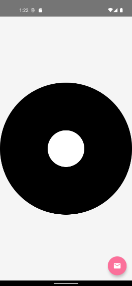
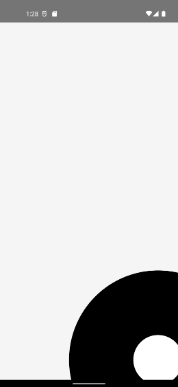
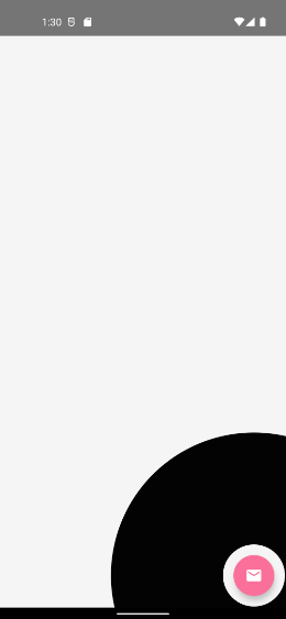
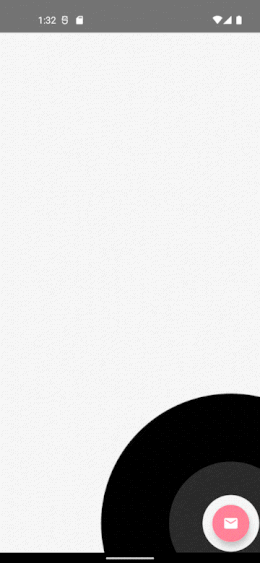
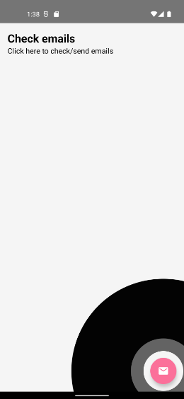
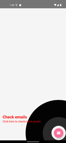
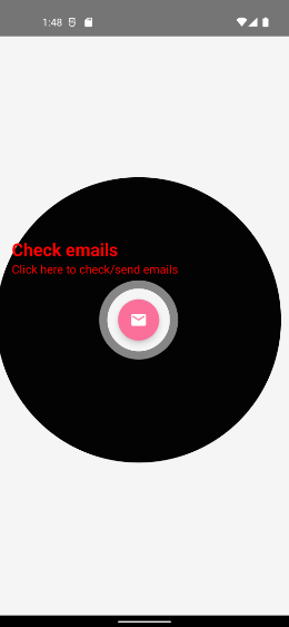
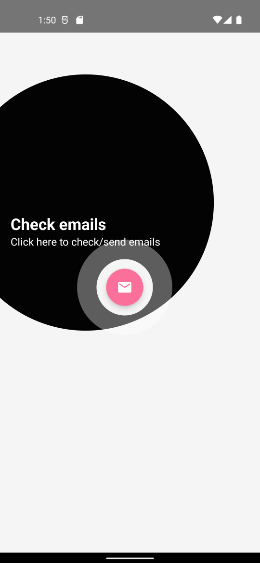
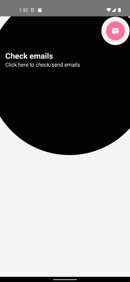
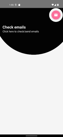
Incorporating curve anchor tags into bottom navigation design offers a fresh and interactive way to enhance user engagement. The essential components of this design include the shape of the curve, the anchor tag positions, and the overall color palette. These elements not only make the navigation visually appealing but also improve usability by guiding users through your app seamlessly. To begin, it is vital to choose a curve style that fits your app’s theme while ensuring that anchor tags remain recognizable and accessible. consider using a material design approach to keep the interface clean and modern.
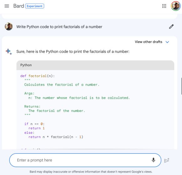
Setting up curve anchor tags involves several key steps: first, ensure that your layout is appropriately structured. Use an XML layout file for your bottom navigation view, and implement custom drawable resources to achieve the curved effect. Here’s a simple illustration of the necessary attributes:
| Attribute | Description |
|---|---|
| app:label | Defines the text displayed on each anchor. |
| app:itemIconTint | Controls the color of the icons based on their state. |
| app:itemBackground | Sets the background for each item, ideally styled to match the curves. |
Enhancing user experience with customizable curve designs requires thoughtful testing and optimization. Gather user feedback and conduct usability tests to see how users interact with your curves and anchor tags. Best practices include monitoring touch response times, evaluating visual clarity, and adjusting the curvature’s depth based on real-world usage patterns. You can also consider A/B testing different curve designs to determine which configuration yields the highest user satisfaction and engagement rates, ensuring that your bottom navigation view not only looks good but functions flawlessly across different devices.
Q&A
Q&A: How to Implement Curve Anchor Tag in bottom Navigation View in Android
Q1: what is a Bottom Navigation View in Android, and why is it important?
A1: The Bottom navigation View is a UI component in Android that provides speedy access to top-level navigation items within an app. It enhances user experience by allowing for seamless navigation and helps maintain focus on the content, ensuring that users can easily move between different sections of the app.
Q2: What is a Curve Anchor Tag, and how does it differ from a standard bottom navigation item?
A2: A Curve Anchor Tag is an innovative design element that visually enhances the Bottom Navigation View by adding a curved shape beneath the selected item.This distinctive design not only highlights the selected tab but also adds aesthetic appeal, making the navigation experience more engaging.Unlike standard navigation items, the Curve Anchor Tag integrates visual elements that guide the user’s attention.
Q3: What are the key components needed to implement a Curve Anchor Tag in a Bottom Navigation View?
A3: To implement a curve Anchor Tag, you will need:
- A Bottom Navigation View to serve as the primary navigation.
- Custom drawable resources for the curve shape.
- A layout file that includes the Bottom Navigation View and any necessary container layouts for fragments or content.
- Optional: Animation effects to enhance the transition between navigation items.
Q4: Can you provide a basic step-by-step guide to implementing a Curve Anchor Tag?
A4: Certainly! Follow these steps:
- Add Dependencies: Ensure you have the necessary dependencies in your
build.gradlefile for Material Components.
- Create Drawable Resource: Define your curve shape in a custom XML drawable resource file under the
res/drawablefolder.
- Layout Setup: In your activity’s layout XML file, add the
BottomNavigationViewand include your curve drawable as the background.
- Fragment Transactions: Set up the logic to handle fragment transactions when an item is selected in the Bottom Navigation View.
- Animation (Optional): Implement any animation for your curve anchor to transition smoothly when navigation items are selected. This can be achieved using animations or transitions in XML or programmatically.
- Testing: Run the app to ensure that the curve anchor behaves as expected and provides a visually appealing navigation experience.
Q5: What are some best practices to consider when using a Curve Anchor Tag?
A5: Here are a few best practices:
- Consistency: Ensure that your curve anchor design is consistent with the overall branding and style of your app.
- Accessibility: Make sure that the navigation items and curve are accessible to all users, including those using screen readers.
- Performance: Test the performance on various devices to ensure that the animation and transitions do not hinder the app’s responsiveness.
- User Feedback: Consider gathering user feedback during testing to learn how intuitively they navigate your app and respond to the curve anchor tag.
Q6: What tools can assist in customizing the Bottom Navigation View effectively?
A6: Various tools can definitely help, such as:
- Android Studio: The built-in layout editor provides a visual way to customize your Bottom Navigation View and view your changes in real-time.
- Design Tools: Tools like figma or Adobe XD can definitely help prototype the design of your Bottom Navigation View, including the Curve Anchor Tag.
- Material Design Guidelines: Following these guidelines helps in maintaining standard UI concepts and ensures compatibility across different Android devices.
Q7: Where can I find additional resources or examples for implementing this feature?
A7: Great resources include:
- Android Developer Documentation: Official guides provide in-depth info on Views and Navigation Components.
- GitHub: Explore repositories with sample projects that demonstrate Bottom Navigation and custom drawables.
- UI/UX Design Communities: Websites like Dribbble or Behance can inspire unique curve anchor designs.
By exploring these answers,you can grasp the concept of implementing a Curve Anchor Tag in your Bottom Navigation View and enhance your Android app’s navigation experience creatively. Happy coding!
Wrapping Up
implementing curve anchor tags in a bottom navigation view in Android can substantially enhance your app’s aesthetic appeal and user experience. By leveraging the power of modern design principles and intuitive navigation patterns,you can create a more engaging interface that draws users in and keeps them exploring.
As you embark on this journey of customization,remember to test your design across different devices to ensure a seamless experience for all users. The balance between functionality and beauty is crucial, and with careful implementation, your bottom navigation can become a standout feature of your application.
So, why not take that next step? Dive into the code, experiment with styles, and bring your vision to life. Happy coding, and may your apps not only function flawlessly but also resonate with users in a visually captivating way!


